

정보
- 업무명 : 라디오존데 (Radiosonde) 관측 자료를 이용한 고도별 온도 (Temperature) 및 상대 습도 (Relative Humidity) 등고선 가시화
- 작성자 : 이상호
- 작성일 : 2020-03-02
- 설 명 :
- 수정이력 :
내용
[개요]
- 안녕하세요? 기상 연구 및 웹 개발을 담당하고 있는 해솔입니다.
- 라디오존데 (Radiosonde)를 기구에 매달아 비양시켜 지상으로부터 30km이상 상공까지 일정한 시간 간격으로 대기상태를 직/간접적으로 관측합니다. 이러한 자료는 무선 송수신장치를 통해 지상으로 전송되고 지상 수신장치에서 처리됩니다.
- 기상청은 일 2회 정기 고층 기상관측 (오전 09시, 오후 09시)을 하고 우리나라에 태풍, 집중호우 등과 같은 위험기상 현상이 발생 또는 예측될 때는 정기관측시각 이외에 03시, 15시에 특별기상관측을 수행합니다.
- 따라서 라디오 존데 관측 자료를 이용한 고도별 온도 및 상대 습도 등고선 가시화를 소개해 드리고자 합니다.

[특징]
- 라디오 존데 (Radiosonde) 자료를 이해하기 위해서 가시화가 요구되며 이 프로그램은 이러한 목적을 달성하기 위한 소프트웨어
[기능]
- 온도 및 이슬점 온도를 이용한 상대 습도 변환
- 다단계 B-Spline 근사화를 이용한 온도 및 상대습도 내삽
- 고도별 온도 및 상대습도 가시화
[활용 자료]
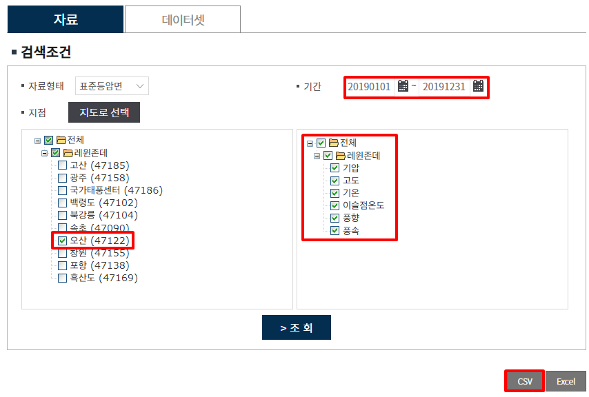
- 자료명 : OBS_SONDE_F00508_20200301232133.csv
- 자료 종류 : 라디오존데 관측 자료 (검색 조건은 아래 캡쳐본 참조)
- 확장자 : csv
- 지점 : 오산
- 기간 : 2019년년 1월 1일 - 2020년 12월 31일
- 시간 해상도 : 1일 2회 (09, 21시) 또는 4회 (03, 09, 15, 21시)
- 제공처 : 기상자료개방포털
기상자료개방포털
자료설명 라디오존데를 기구에 매달아 비양시켜 지상으로부터 30km이상 상공까지 일정한 시간 간격으로 대기상태를 직 · 간접적으로 관측합니다. 관측자료는 무선 송수신장치를 통해 지상으로 전송되고 지상 수신장치에서 처리됩니다. 기상청은 일 2회 정기 고층기상관측(오전 9시, 오후 9시)을 하고 우리나라에 태풍, 집중호우 등과 같은 위험기상 현상이 발생 또는 예측될 때는 정기관측시각 이외에 3시, 15시에 특별기상관측을 합니다. 자료설명 자료형태 시간(12시간
data.kma.go.kr
OBS_SONDE_F00508_20200301232133.csv
1.00MB
- 기상자료개방포털 관련 자세한 내용은 링크를 참조하시기 바랍니다.
[연구개발] 국내 기상/기후자료 데이터 시스템 이해
정보 업무명 : 자유 서식 작성자 : 이상호 작성일 : 2019-12-13 설 명 : 수정이력 : 내용 [국내 기후자료 데이터시스템 이해] 최근 기후변화에 의한 이상기상이 일상화되어 가는 현시점에서 기후변화 대책 수립을..
shlee1990.tistory.com
[자료 처리 방안 및 활용 분석 기법]
- 상대 습도 변환
- R에서 온도 및 이슬점 온도에서 수증기 측정 값 계산으로서 humidity 패키지 사용
- 즉 기상에서 수증기 측정에는 증기압, 상대 습도, 절대 습도, 비습도 및 혼합 비율이 일반적으로 사용됩니다. 이러한 패키지는 포화 증기압 (hPa), 부분 수증기 압력 (Pa), 상대 습도 (%), 절대 습도 (kg /m3), 비중 (kg/kg) 및 혼합 비율 (온도 (K)와 이슬점 (K)에서 kg/kg) 그리고 습도 측정 간의 변환 기능도 제공됩니다.
- 다단계 B-Spline 근사화 (Multi level B-Spline Approximation)를 통해 3D 내삽
- R에서 규칙 및 불규칙 격자에 대해 데이터 내삽 방법로서 MBA 패키지 사용
- 최근 많은 이미지 영상과 관련하여 다양한 연구 분야에서 데이터 보간에 대한 요구는 증가 추세에 있으며 이에 대해 많은 방법이 제안되어있다.
- 이 중 B-Spline 근사화는 약간의 오차를 함유하지만 자연스럽고 매끄러운 형상 변화가 가능한 방법이다.
- 또한 이러한 오차 감소 기법으로서 다단계 B-Spline 근사화 방법이 제안되었다. 이 방법은 B-spline 근사화의 장점 (자연그러움, 매끄러움)을 유지하면서 데이터 보간을 해준다.
- 그러나 정밀도 향상에 따라 필요한 계산량이 기존의 B-Spline 근사화에 비해 크게 증가한다. 이는 사용상의 가장 큰 병목이 되나 최근에 많은 계산 및 시간 절감이 되었다.
- R에서 규칙 및 불규칙 격자에 대해 데이터 내삽 방법로서 MBA 패키지 사용
[사용법]
- 입력 자료를 동일 디렉터리 위치
- 소스 코드를 실행
(Rscript Visualization_of_Contour_from_Temperature_and_Relative_Humidity_
Using_Radiosonde_Observation_Data.R) - 가시화 결과를 확인
[사용 OS]
- Windows 10
[사용 언어]
- R v3.6.2
- R Studio v1.2.5033
소스 코드
[명세]
- 전역 설정
- 최대 10 자리 설정
- 메모리 해제
- 영어 설정
# Set Option
options(digits = 10)
memory.limit(size = 9999999999999)
Sys.setlocale("LC_TIME", "english")
- 라이브러리 읽기
# Library Load
library(data.table)
library(tidyverse)
library(lubridate)
library(RadioSonde)
library(MBA)
library(ggrepel)
library(extrafont)
library(timeDate)
library(metR)
library(scales)
library(humidity)
- 파일 읽기
# File Read
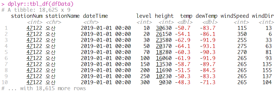
dfData = data.table::fread("INPUT/KMA/OBS_SONDE_F00508_20200301232133.csv", header = FALSE, skip = 1)
colnames(dfData) = c("stationNum", "stationName", "dateTime", "level", "height", "temp", "dewTemp", "windSpeed", "windDir")
dplyr::tbl_df(dfData)
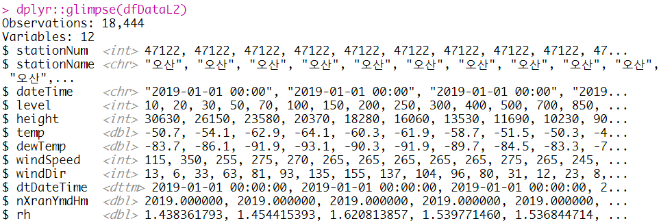
- Data Frame를 이용한 L1 전처리
- 시간 문자열을 날짜형으로 변환 (dtDateTime)
- 시간 날짜형을 십진수로 변환 (nXranYmdHm)
- "상기 상대 습도 변환"에서와 같이 온도 및 이슬점 온도를 통해 변환 (rh)
# L1 Processing Using Data Frame
dfDataL1 = dfData %>%
    dplyr::mutate(
        dtDateTime = readr::parse_datetime(dateTime, format = "%Y-%m-%d %H:%M")
        , nXranYmdHm = lubridate::decimal_date(dtDateTime)
        , rh = humidity::RH(temp, dewTemp, isK = FALSE)
    )


# NA Delete
dfDataL2 = na.omit(dfDataL1)

dplyr::glimpse(dfDataL2)
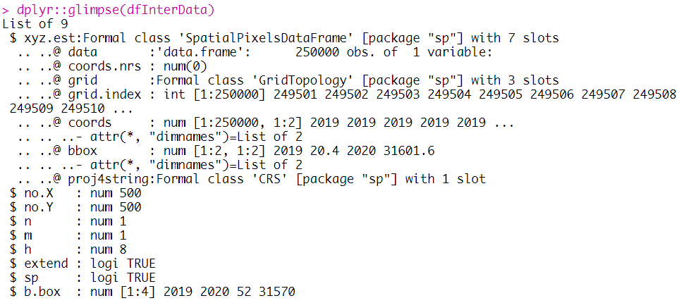
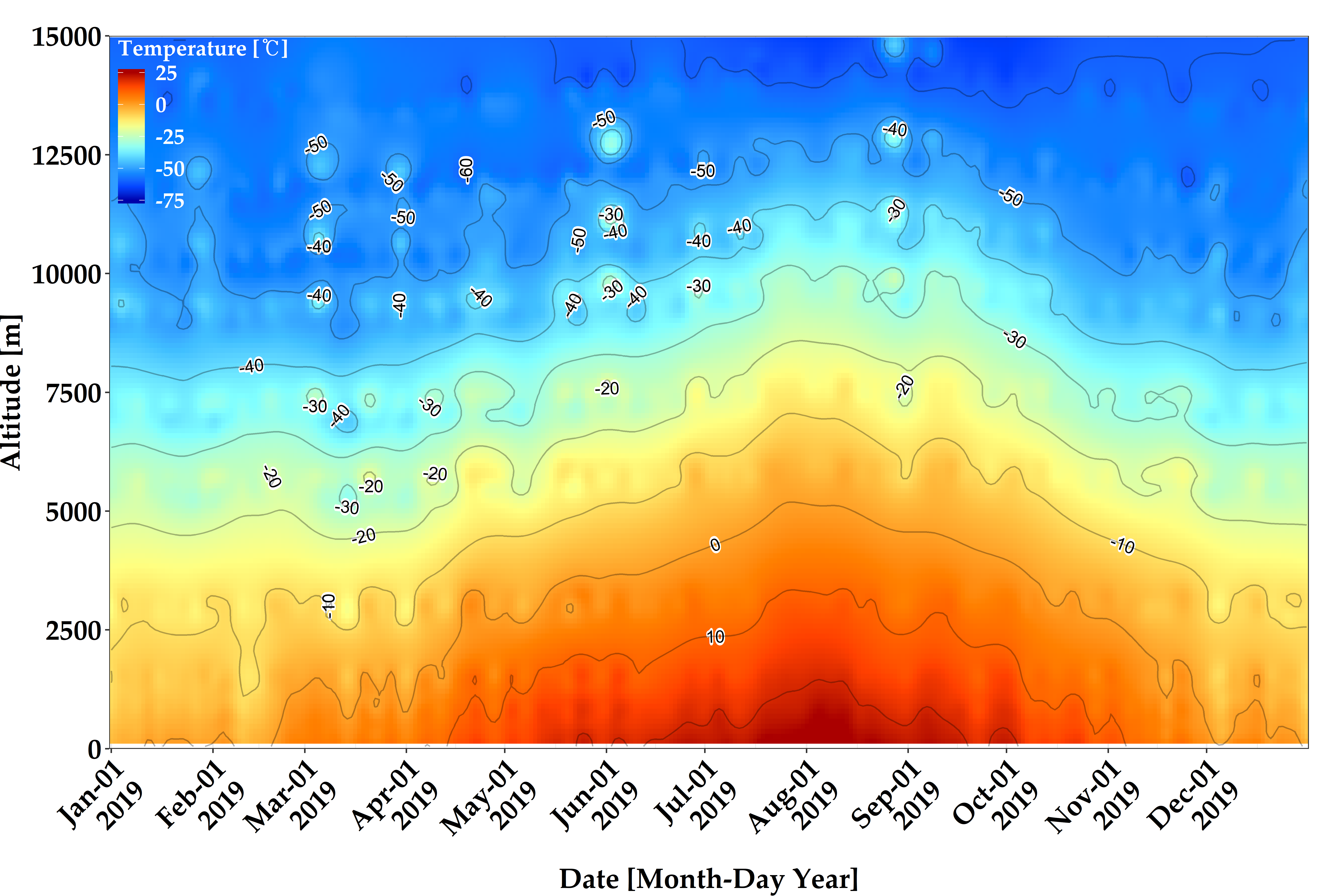
- 다단계 B-Spline 근사화를 이용한 온도 내삽
- MBA:mba.surf를 통해 3차원 변수 (날짜, 고도, 온도)에 내삽
- 규칙 격자 (500 x 500)에 대한 설정 및 변수 이름 변경 (고도 > yAxis, 온도 > zAxis)
- 날짜 (xAxis)의 경우 10 진수를 날짜형으로 변환
- 자세한 내용은 "상기 자료 처리 방안 및 활용 분석 기법"에서 참조
# Temperature Interpolation Using Multilevel B-Spline Approximation
dfInterData = dfDataL2 %>%
    dplyr::select(nXranYmdHm, height, temp) %>%
    MBA::mba.surf(no.X = 500, no.Y = 500, extend = TRUE, sp = TRUE)

dplyr::glimpse(dfInterData)

dfInterDataL1 = dfInterData %>%
    as.data.frame() %>%
    dplyr::mutate(
        xAxis = lubridate::date_decimal(xyz.est.x)
    ) %>%
    dplyr::rename(
        yAxis = xyz.est.y
        , zAxis = xyz.est.z
    )

dplyr::tbl_df(dfInterDataL1)
- 온도 가시화을 위한 초기 설정
# Set Value for Visualization
cbMatlab = colorRamps::matlab.like(11)
xAxisMin = min(dfInterDataL1$xAxis, na.rm = TRUE)
xAxisMax = max(dfInterDataL1$xAxis, na.rm = TRUE)
font = "Palatino Linotype"
- ggplot2을 이용한 온도 가시화
# Visualization Using ggplot2
ggplot(data = dfInterDataL1, aes(x = xAxis, y = yAxis, fill = zAxis, z = zAxis)) +
    theme_bw() +
    geom_tile() +
    metR::geom_text_contour(stroke = 0.2, check_overlap = TRUE, rotate = TRUE, na.rm = TRUE) +
    geom_contour(color = "black", alpha = 0.3) +
    scale_fill_gradientn(colours = cbMatlab, limits=c(-75, 25), breaks = seq(-75, 25, 25), na.value = cbMatlab[length(cbMatlab)]) +
    scale_x_datetime(breaks = seq(xAxisMin, xAxisMax, "month"), labels = date_format("%b-%d\n%Y", tz="UTC"), expand = c(0, 0)) +
    scale_y_continuous(breaks = seq(0, 30000, 5000), limits = c(0, 30000), expand = c(0, 0)) +
    labs(
        x = "Date [Month-Day Year]"
        , y = "Altitude [m]"
        , fill = "Temperature [℃]"
        , colour = ""
        , title  = ""
    ) +
    theme(
        plot.title = element_text(face = "bold", size = 18, color = "black")
        , axis.title.x = element_text(face = "bold", size = 18, colour = "black")
        , axis.title.y = element_text(face = "bold", size =18, colour = "black", angle=90)
        , axis.text.x  = element_text(angle = 45, hjust = 1, face = "bold", size = 18, colour = "black")
        , axis.text.y  = element_text(face = "bold", size = 18, colour = "black")
        , legend.title = element_text(face = "bold", size = 14, colour = "white")
        , legend.position = c(0, 1)
        , legend.justification = c(0, 0.96)
        , legend.key = element_blank()
        , legend.text = element_text(size = 14, face = "bold", colour = "white")
        , legend.background = element_blank()
        , text=element_text(family = font)
        , plot.margin = unit(c(0, 8, 0, 0), "mm")
        ) +
    ggsave(filename = paste0("FIG/Temperature_Visualization_Using_ggplot2.png"), width = 8, height = 10, dpi = 600)
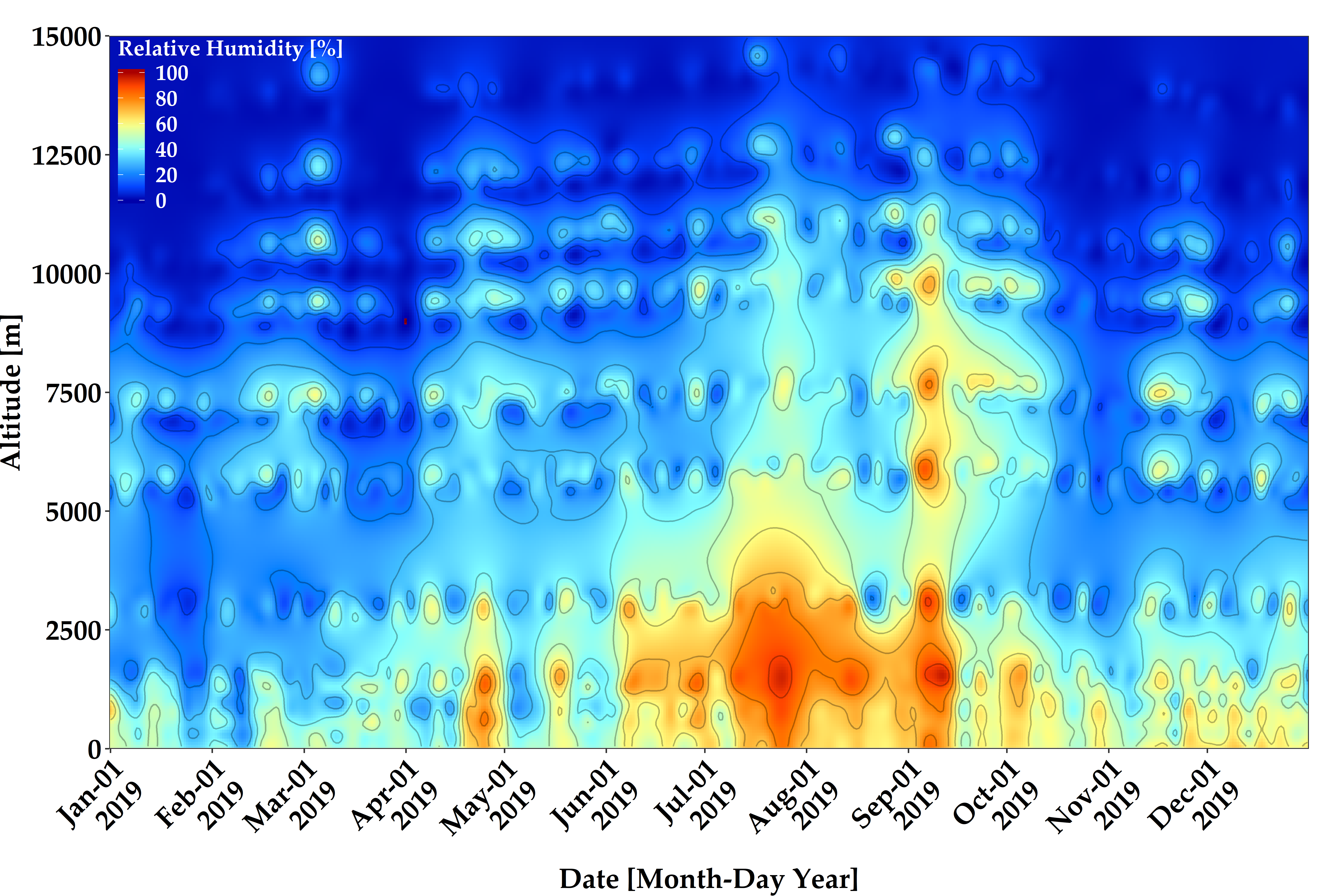
- 다단계 B-Spline 근사화를 이용한 상대 습도 내삽
- MBA:mba.surf를 통해 3차원 변수 (날짜, 고도, 온도)에 내삽
- 규칙 격자 (500 x 500)에 대한 설정 및 변수 이름 변경 (고도 > yAxis, 상대 습도 > zAxis)
- 날짜 (xAxis)의 경우 10 진수를 날짜형으로 변환
- 자세한 내용은 "상기 자료 처리 방안 및 활용 분석 기법"에서 참조
# Relative Humidity Using Multilevel B-Spline Approximation
dfInterData = dfDataL2 %>%
    dplyr::select(nXranYmdHm, height, rh) %>%
    MBA::mba.surf(no.X = 300, no.Y = 300, extend = TRUE, sp = TRUE)


dfInterDataL1 = dfInterData %>%
    as.data.frame() %>%
    dplyr::mutate(
        xAxis = lubridate::date_decimal(xyz.est.x)
    ) %>%
    dplyr::rename(
        yAxis = xyz.est.y
        , zAxis = xyz.est.z
    )
- 상대 습도 가시화을 위한 초기 설정
# Set Value for Visualization
cbMatlab = colorRamps::matlab.like(11)
xAxisMin = min(dfInterDataL1$xAxis, na.rm = TRUE)
xAxisMax = max(dfInterDataL1$xAxis, na.rm = TRUE)
font = "Palatino Linotype"
- ggplot2을 이용한 상대 습도 가시화
# Visualization Using ggplot2
ggplot(data = dfInterDataL1, aes(x = xAxis, y = yAxis, fill = zAxis, z = zAxis)) +
    theme_bw() +
    geom_tile() +
    metR::geom_text_contour(stroke = 0.2, check_overlap = TRUE, rotate = TRUE, na.rm = TRUE) +
    geom_contour(color = "black", alpha = 0.3) +
    scale_fill_gradientn(colours = cbMatlab, limits=c(-75, 25), breaks = seq(-75, 25, 25), na.value = cbMatlab[length(cbMatlab)]) +
    scale_x_datetime(breaks = seq(xAxisMin, xAxisMax, "month"), labels = date_format("%b-%d\n%Y", tz="UTC"), expand = c(0, 0)) +
    scale_y_continuous(breaks = seq(0, 30000, 5000), limits = c(0, 30000), expand = c(0, 0)) +
    labs(
        x = "Date [Month-Day Year]"
        , y = "Altitude [m]"
        , fill = "Temperature [℃]"
        , colour = ""
        , title  = ""
    ) +
    theme(
        plot.title = element_text(face = "bold", size = 18, color = "black")
        , axis.title.x = element_text(face = "bold", size = 18, colour = "black")
        , axis.title.y = element_text(face = "bold", size =18, colour = "black", angle=90)
        , axis.text.x  = element_text(angle = 45, hjust = 1, face = "bold", size = 18, colour = "black")
        , axis.text.y  = element_text(face = "bold", size = 18, colour = "black")
        , legend.title = element_text(face = "bold", size = 14, colour = "white")
        , legend.position = c(0, 1)
        , legend.justification = c(0, 0.96)
        , legend.key = element_blank()
        , legend.text = element_text(size = 14, face = "bold", colour = "white")
        , legend.background = element_blank()
        , text=element_text(family = font)
        , plot.margin = unit(c(0, 8, 0, 0), "mm")
        ) +
    ggsave(filename = paste0("FIG/Temperature_Visualization_Using_ggplot2.png"), width = 8, height = 10, dpi = 600)
[전체]
참고 문헌
[논문]
- 없음
[보고서]
- 없음
[URL]
- 없음
문의사항
[기상학/프로그래밍 언어]
- sangho.lee.1990@gmail.com
[해양학/천문학/빅데이터]
- saimang0804@gmail.com
'프로그래밍 언어 > R' 카테고리의 다른 글
| [R] 파스텔 톤의 컬러 팔레트를 추가해주는 "ghibli"패키지 (0) | 2020.03.03 |
|---|---|
| [R] 데이터의 구조를 plot으로 확인할 수 있는 "visdat" 패키지 소개 (0) | 2020.03.03 |
| [R] 데이터의 분포를 그래프로 확인하는 "ggridges"패키지 (0) | 2020.03.02 |
| [R] 직달 일사계 (CHP1, MS56, DR02, GWNU) 비교 관측 자료를 이용한 감도정수 보정 및 시계열 가시화 (0) | 2020.03.01 |
| [R] 하와이 마우나로아 (Manuna Loa)에서 이산화탄소 (CO2) 농도 자료를 이용한 통계 처리 및 시계열 가시화 (0) | 2020.03.01 |