

정보
-
업무명 : 하와리 마우나로아 (Manuna Loa)에서 이산화탄소 (CO2) 농도를 이용한 통계 처리 및 시계열 가시화
-
작성자 : 이상호
-
작성일 : 2020-03-01
-
설 명 :
-
수정이력 :
내용
[개요]
-
안녕하세요? 기상 연구 및 웹 개발을 담당하고 있는 해솔입니다.
-
최근 기록적인 폭염 및 산불과 같은 위험 기상은 전세계에 찾아오고 있다. 이는 세계기상기구 (WMO)에 의하면 기후 변화의 결과로 초래되었다고 합니다
-
이러한 기후 변화의 주범인 이산화탄소는 온실 가스로서 산업 혁명으로 인한 화석 연료 사용함에 따라 지속적으로 증가하고 있습니다. 그 결과 지구 온난화는 가속화될 뿐만 아니라 해수면 상승, 이상 기온 현상 등 기상 이슈가 발생합니다.
-
따라서 하와이 마우나로아 (Manuna Loa)에서 이산화탄소 농도 자료를 이용한 통계 처리 및 시계열 가시화를 소개해 드리고자 합니다.

[특징]
-
이산화탄소 농도 자료를 이해하기 위해서 통계 처리 및 가시화가 요구되며 이 프로그램은 이러한 목적을 달성하기 위한 소프트웨어
[기능]
-
이산화탄소 농도 자료를 이용한 통계 처리 및 시계열 가시화
[활용 자료]
-
자료명 : co2_mm_mlo.txt
-
자료 종류 : 이산화탄소 월별 평균 데이터
-
확장자 : txt
-
기간 : 1958년 3월 - 2020년 1월
-
시간 해상도 : 월 주기
-
제공처 : NOAA Earth System Research Laboratory Global Monitoring Division
ESRL Global Monitoring Division - Global Greenhouse Gas Reference Network
--> Data The complete Mauna Loa CO2 records described on this page are available. Additional CO2 data from Mauna Loa and other worldwide sampling sites can be found using the ESRL/GMD Data Navigator of public data sets. These values are subject to change d
www.esrl.noaa.gov

[자료 처리 방안 및 활용 분석 기법]
-
없음
[사용법]
-
입력 자료를 동일 디렉터리 위치
-
소스 코드를 실행
(Rscript Time_Series_Visualization_Using_CO2_Concentration_Data_in_Manuna_Loa.R) -
가시화 결과를 확인
[사용 OS]
-
Windows 10
[사용 언어]
-
R v3.6.2
-
R Studio v1.2.5033
소스 코드
[명세]
-
전역 설정
-
최대 10 자리 설정
-
메모리 해제
-
# Set Option
options(digits = 10)
memory.limit(size = 9999999999999)
-
라이브러리 읽기
# Library Load
library(tidyverse)
library(data.table)
library(extrafont)
library(ggpubr)
library(ggpmisc)
library(hash)
-
함수 정의
-
Map 형태인 전역 변수를 설정 (fnSetMap) 및 가져오기 (fnGetMap)를 위한 유용한 함수
-
# Function Load
fnSetMap = function(maData, sKey, sValue) {

   for (iCount in 1:length(sKey)) {
      # check whether the key exists
      isKey = has.key(sKey[iCount], maData)

      if (isKey == TRUE) {
         cat(sKey[iCount], "is Duplicated", "\n")
      }

      maData[sKey[iCount]] = sValue[iCount]
   }
}

fnGetMap =  function(maData, sKey) {

   # check whether the key exists
   isKey = has.key(sKey, maData)

   if (isKey == FALSE) {
      cat("Key is not exist")
   }

   return (maData[[sKey]])
}
-
전역 변수 초기화
# Global Variable Init
maData = hash()
-
파일 읽기
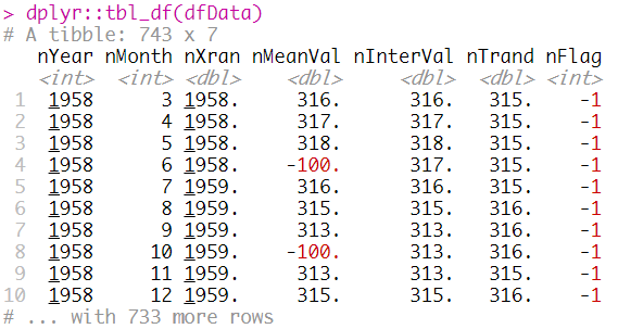
# File Read
dfData = data.table::fread("INPUT/co2_mm_mlo.txt", header = FALSE, sep = " ", skip = 72)

colnames(dfData) = c("nYear", "nMonth", "nXran", "nMeanVal", "nInterVal", "nTrand", "nFlag")

dplyr::tbl_df(dfData)
-
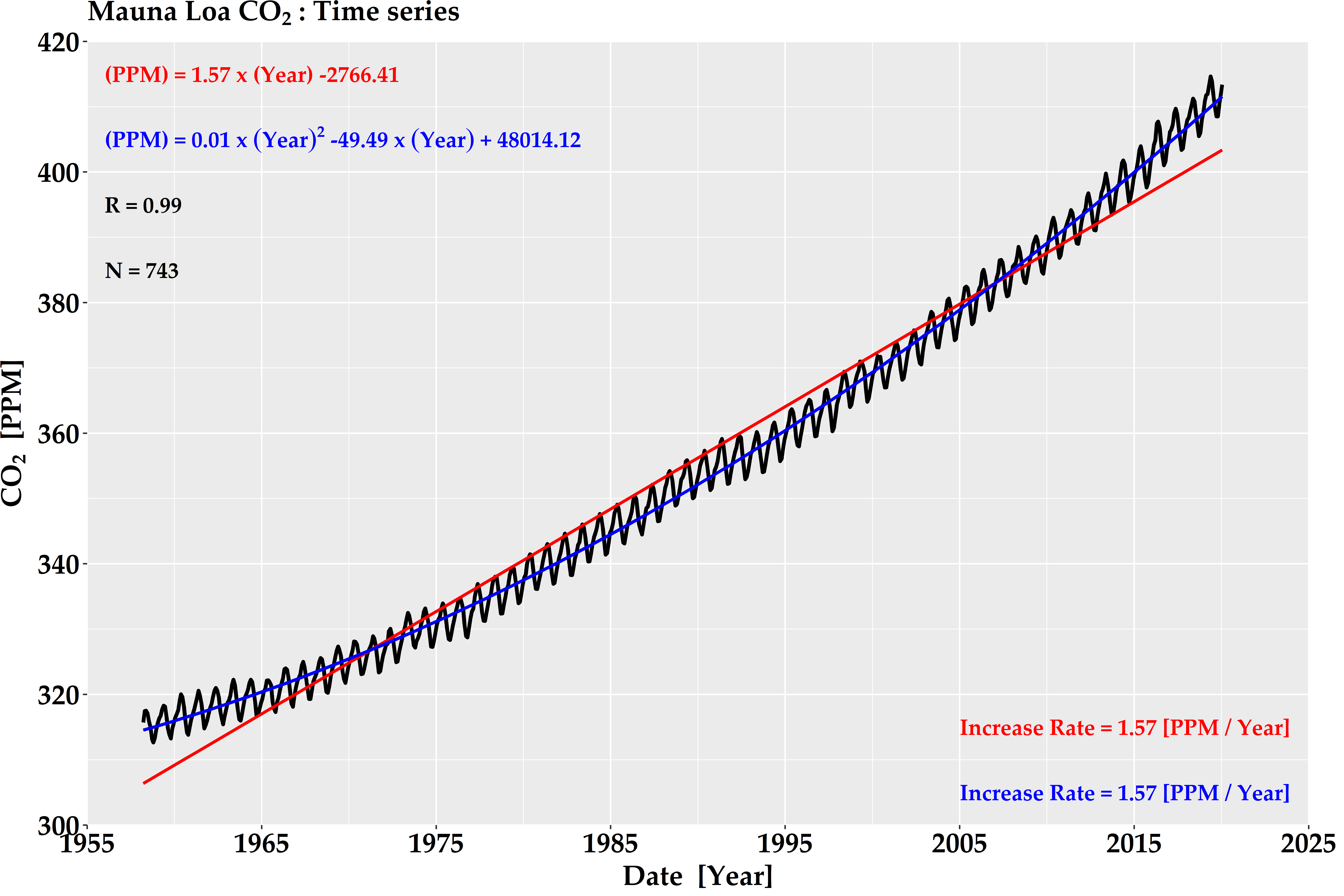
통계 결과 계산
-
자료 개수 (nNumber)
-
상관계수 (nCorr)
-
선형 회귀 (oLmFit), 증가율 (oLmIncreRate)
-
비선형 회귀 (oNlsFit), 증가율 (oNlsIncreRate)
-
# Get Statistical Value
# Number, Correlation, Linear slope / intercept

xAxis = dfData$nXran
yAxis = dfData$nInterVal

nNumber = length(xAxis)
nCorr = round(cor(xAxis, yAxis), 3)

oLmFit = lm(yAxis ~ xAxis)
nLmSlope = round(coef(oLmFit)[[2]], 2)
nLmInter = round(coef(oLmFit)[[1]], 2)

oNlsFit = lm(yAxis ~ I(xAxis^2) + I(xAxis))
nNlsSlope = round(coef(oNlsFit)[[2]], 3)
nNlsSlope2 = round(coef(oNlsFit)[[3]], 3)
nNlsInter = round(coef(oNlsFit)[[1]], 3)

nLmIncreRate = (fitted(oLmFit)[nNumber] - fitted(oLmFit)[1]) / (xAxis[nNumber] - xAxis[1])

nNlsIncreRate = (fitted(oNlsFit)[nNumber] - fitted(oNlsFit)[1]) / (xAxis[nNumber] - xAxis[1])
-
ggplot2에서 텍스트 삽입을 위한 전처리
-
앞서 설명한 통계 수치는 소수점 둘째 자리까지 기입
-
최근 stat_poly_eq 함수를 통해 ggplot2에서 회귀식을 삽입할 수 있으나 첨자, 굵게 표시 등이 불편
-
따라서 번거로우나 템플릿을 생성하여 값을 넣어주는 방식을 사용
-
그리고 maData 전역 변수를 통해 Key와 Value 형태로 설정 및 가져오기 사용
-
이는 속도 개선뿐만 아니라 전역 변수를 별도로 관리하기 위함
-
# Set Equation For Label
sLmEqu = sprintf(
   paste0("(PPM) = %.02f x (Year) %.02f")
   , nLmSlope, nLmInter
)

sNlsEqu = sprintf(
   paste0("bold( \"(PPM)\" ~ \"=\" ~ \"%.02f\" ~ x ~ (Year)^\"2\" ~ \"%.02f\" ~ x ~ (Year) ~  \"+\" ~ \"%.02f\" )")
   , nNlsSlope, nNlsSlope2, nNlsInter
)

sCorrEqu = sprintf(
   paste0("R = %.02f")
   , nCorr
)

sNumber = sprintf(
   paste0("N = %d")
   , nNumber
)

sLmIncreRateEqu = sprintf(
   paste0("Increase Rate = %.02f [PPM / Year]")
   , nLmIncreRate
)

sNlsIncreRateEqu = sprintf(
   paste0("Increase Rate = %.02f [PPM / Year]")
   , nNlsIncreRate
)

# set Key, Value
sKey = c("LM_EQU", "NLS_EQU", "CORR_EQU", "CORR_NUMBER", "LM_INCRE_RATE_EQU", "NLS_INCRE_RATE_EQU")
sValue = c(sLmEqu, sNlsEqu, sCorrEqu, sNumber, sLmIncreRateEqu, sNlsIncreRateEqu)

# set Map Data
fnSetMap(maData, sKey, sValue)

-
시계열을 위한 초기 설정
# Set Value for Visualization
xAxis = dfData$nXran
yAxis = dfData$nInterVal

xcord = 1956
ycord = seq(415, 0, -10)
font = "Palatino Linotype"
-
ggplot2를 이용한 시계열
ggplot(dfData, aes(x = xAxis, y = yAxis)) +
   geom_line(size = 1.2) +
   stat_smooth(method = "lm", formula = y ~ x, color="red", se = FALSE) +
   stat_smooth(method = "lm", formula = y ~ I(x^2) + I(x), color = "blue", se = FALSE) +
   annotate("text", x = xcord, y = ycord[1], label = fnGetMap(maData, "LM_EQU"), size = 5, hjust = 0, color = "red", fontface = "bold", family = font) +
   annotate("text", x = xcord, y = ycord[2], label = fnGetMap(maData, "NLS_EQU"), parse = TRUE, size = 5, hjust = 0, color = "blue",family = font) +
   annotate("text", x = xcord, y = ycord[3], label=fnGetMap(maData, "CORR_EQU"), size = 5, hjust = 0, color = "black", fontface = "bold", family = font) +
   annotate("text", x = xcord, y = ycord[4], label = fnGetMap(maData, "CORR_NUMBER"), size = 5, hjust = 0, color="black", fontface = "bold", family = font) +
   annotate("text", x = 2005, y = 315, label = fnGetMap(maData, "LM_INCRE_RATE_EQU"), size = 5, hjust = 0, color = "red", fontface = "bold", family = font) +
   annotate("text", x = 2005, y = 305, label = fnGetMap(maData, "NLS_INCRE_RATE_EQU"), size = 5, hjust = 0, color = "blue", fontface = "bold", family = font) +
   scale_x_continuous(breaks = seq(1955, 2025, by = 10), expand = c(0,0), limits = c(1955, 2025)) +
   scale_y_continuous(breaks = seq(300, 420, by = 20),  expand = c(0,0), limits = c(300, 420)) +
   labs(
      x = expression(paste(bold("Date  [Year]")))
      , y = expression(paste(bold("CO"[bold("2")]~" [PPM]")))
      , fill = ""
      , colour = ""
      , title = expression(paste(bold("Mauna Loa CO"[bold("2")]~": Time series")))
   ) +
   theme(
      plot.title = element_text(face = "bold", size = 18, color = "black")
      , axis.title.x = element_text(face = "bold", size = 18, colour = "black")
      , axis.title.y = element_text(face = "bold", size=18, colour = "black", angle = 90)
      , axis.text.x = element_text(face = "bold", size=18, colour = "black")
      , axis.text.y = element_text(face = "bold", size=18, colour = "black")
      , legend.position = c(1, 1.03)
      , legend.justification = c(1, 1)
      , legend.key = element_blank()
      , legend.text = element_text(size = 14, face = "bold")
      , legend.title = element_text(face = "bold", size = 14, colour = "black")
      , legend.background=element_blank()
      , text=element_text(family = font)
      , plot.margin = unit(c(0, 8, 0, 0), "mm")
   ) +
   ggsave(filename = paste0("FIG/Mauna_Loa_CO2.png"), width = 12, height = 8, dpi = 600)
-
이 그림에서와 같이 자연적/인위적 요인에 따른 계절 변화 원인은 다음과 같습니다.
-
자연적 요인
-
북반구가 봄과 여름이 되면 초목의 잎이 이산화탄소를 흡수하여 전 세계적으로 농도가 감소합니다.
-
반면에 북반구가 가을과 겨울이 되면 잎이 져서 대기 중 이산화탄소 농도가 다시 증가하는 것은 지구 전체가 1년에 한 번씩 크게 숨을 들이마셨다가 뱉는 격이라고 생각한다. 이때 50-55 %가 광합성 및 해양에 흡수됩니다.
-
-
인위적 요인
-
산업혁명 이후 인간활동 변화 (석탄 및 석유와 같은 화석연료 소비 증가, 산림파괴)는 이산화탄소 농도를 증가시켰습니다.
-
즉 겨울철의 경우 석탄 소비 증가로 인한 이산화탄소 농도가 증가되고 반면에 여름철에서는 농도 감소를 초래하였습니다.
-
-
[전체]
참고 문헌
[논문]
- 없음
[보고서]
- 없음
[URL]
- 없음
문의사항
[기상학/프로그래밍 언어]
- sangho.lee.1990@gmail.com
[해양학/천문학/빅데이터]
- saimang0804@gmail.com
'프로그래밍 언어 > R' 카테고리의 다른 글
| [R] 데이터의 분포를 그래프로 확인하는 "ggridges"패키지 (0) | 2020.03.02 |
|---|---|
| [R] 직달 일사계 (CHP1, MS56, DR02, GWNU) 비교 관측 자료를 이용한 감도정수 보정 및 시계열 가시화 (0) | 2020.03.01 |
| [R] nonogram (네모네모로직) 해결 알고리즘 및 가시화 (0) | 2020.02.23 |
| [R] 파일 관련 기본 명령어 (디렉터리/파일 선택, 생성, 삭제, 복사) 소개 (0) | 2020.02.13 |
| [R] 데이터 분석에서 자주 사용하는 "tidyverse" 패키지 소개 (0) | 2020.02.13 |