정보
- 업무명 : 코로나 19 자료 및 회귀 모형 (선형, 비선형)을 이용하여 대한민국 사망자 예측 및 가시화
- 작성자 : 이상호
- 작성일 : 2020-04-07
- 설 명 :
- 수정이력 :
내용
[개요]
- 안녕하세요? 기상 연구 및 웹 개발을 담당하고 있는 해솔입니다.
- 최근 코로나 19 바이러스가 중국에서 발생하여 전 세계의 일반인들에게 전염되고 있습니다. 신규 코로나 바이러스는 이전에 인간에서 확인된 적이없는 새로운 변종입니다. 이 바이러스와 관련된 위험으로 인해 유엔 세계 보건기구 (WHO)는 세계 보건 비상 사태로 선언했습니다 .
- 첫 발원지인 우한에서는 2020년 01월 10일에 최초 사망한 이후로 2020년 02월 14일에 1523명으로 급등했습니다. 특히 2020년 02월 14일에 단 하루 만에 143명이 죽었습니다. 전 세계적으로 바이러스는 주요 28개국 이상을 감염시켰습니다.
- 오늘 포스팅에서는 코로나 19 자료 및 회귀 모형 (선형, 비선형)을 이용하여 대한민국 사망자 예측 및 가시화를 소개해 드리고자 합니다.

[특징]
- 코로나 19 자료를 이해하기 위해서 가시화 기술이 요구되며 이 프로그램은 이러한 목적을 달성하기 위한 소프트웨어
[기능]
- 실시간 코로나 19 자료 다운로드
- 회귀모형을 위한 자료 전처리
- 누적 사망자수 예측
- 가시화
[활용 자료]
- 자료 종류 : 코로나 사망자수 자료
- 확장자 : csv
- 영역 : 전지구
- 기간 : 2019년 12월 31일 - 2020년 04월 06일
- 시간 해상도 : 일 1개
- 제공처 : 유럽 질병 예방 및 통제 센터
- 비고 : R를 이용하여 실시간 다운로드
Download today’s data on the geographic distribution of COVID-19 cases worldwide
The downloadable data file is updated daily and contains the latest available public data on COVID-19. You may use the data in line with ECDC’s copyright policy.
www.ecdc.europa.eu

[자료 처리 방안 및 활용 분석 기법]
- 없음
[사용법]
- 소스 코드 참조
[사용 OS]
- Windows 10
[사용 언어]
- R v3.6.3
- R Studio v1.2.5033
소스 코드
[명세]
- 전역 설정
- 최대 10 자리 설정
- 메모리 해제
- 영어 인코딩 설정
- 폰트 설정
# Set Option
memory.limit(size = 9999999999999)
options(digits = 10)
Sys.setlocale("LC_TIME", "english")
font = "Palatino Linotype"
- 라이브러리 읽기
# Library Load
library(extrafont)
library(tidyverse)
library(modelr)
library(magrittr)
library(lubridate)
library(gam)
library(spData)
library(sf)
library(cowplot)
library(utils)
library(httr)
- 코로나 자료 다운로드
- GET를 통해 실시간 csv 다운로드
# download the dataset from the ECDC website to a local temporary file
GET("https://opendata.ecdc.europa.eu/covid19/casedistribution/csv", authenticate(":", ":", type="ntlm"), write_disk(tf = tempfile(fileext = ".csv")))
- csv 파일 읽기
# read the Dataset sheet into “R”. The dataset will be called "data".
dfData = read.csv(tf)

dplyr::glimpse(dfData)

- Data Frame을 이용한 L1 전처리
- dplyr::filter를 통해 대한민국 (KR) 설정
- readr::parse_date를 통해 문자열을 날짜형으로 변환
- arrange를 통해 날짜형으로 정렬 그리고 사망자수 누적합 (nDeath) 계산
# L1 Processing Using Data Frame
dfDataL1 = dfData %>%
   dplyr::filter(geoId == "KR") %>%
   dplyr::mutate(
      dtDate = readr::parse_date(as.character(dateRep), "%d/%m/%Y")
   ) %>%
   dplyr::arrange(dtDate) %>%
   dplyr::mutate(
      nDeath = cumsum(deaths)
   )

dplyr::glimpse(dfDataL1)

- 가시화
- 데이터 세트에서 정보는 여전히 숨겨져 있기 때문에 가시화 필요
- 가시화는 일반적인 정적 탐색 데이터 분석에서 웹 브라우저의 동적 대화식 데이터 시각화에 이르기까지 다양함
- 특히 R의 기본 plot으로 여러 미학적 측면을 제어 할 수 있으나 Hadley Wickham (2016)이 개발한 ggplot2는 새로운 방법으로 시각화하기 때문에 이를 사용
- 가시화를 위한 초기 설정
- 대만민국에서 코로나 19로 인한 누적 사망자수 시계열
sMinDate = as.Date(min(dfDataL1$dtDate, na.rm = TRUE) - 1)
sMaxDate = as.Date(max(dfDataL1$dtDate, na.rm = TRUE) + 3)

# Visualization Using ggplot2
ggplot(data = dfDataL1, aes(x = dtDate, y = nDeath)) +
   # cowplot::theme_minimal_grid() +
   theme_bw() +
   geom_point() +
   geom_line() +
   scale_x_date(expand = c(0, 0), date_minor_breaks = "7 days", date_breaks = "7 days", date_labels = "%d %b", limits = as.Date(c(sMinDate, sMaxDate))) +
   scale_y_continuous(expand = c(0, 0), minor_breaks = seq(0, 300, 50), breaks = seq(0, 300, 50), limits = c(0, 300)) +
   labs(
      x = "Date [Day Month]"
      , y = "Cumulative Death"
      , fill = ""
      , colour = ""
      , title  = ""
      , subtitle = ""
      , caption = ""
   ) +
   theme(
      plot.title = element_text(face = "bold", size = 18, color = "black")
      , axis.title.x = element_text(face = "bold", size = 18, colour = "black")
      , axis.title.y = element_text(face = "bold", size =18, colour = "black", angle=90)
      , axis.text.x  = element_text(angle = 45, hjust = 1, face = "bold", size = 18, colour = "black")
      , axis.text.y  = element_text(face = "bold", size = 18, colour = "black")
      , legend.title = element_text(face = "bold", size = 14, colour = "white")
      , legend.position = "none"
      , legend.justification = c(0, 0.96)
      , legend.key = element_blank()
      , legend.text = element_text(size = 14, face = "bold", colour = "white")
      , legend.background = element_blank()
      , text = element_text(family = font)
      , plot.margin = unit(c(0, 12, 0, 0), "mm")
   ) +
   ggsave(filename = paste0("FIG2/Img01_Using_ggplot2.png"), width = 10, height = 8, dpi = 600)
- 지난 30일 동안 코로나 바이러스로 인한 사망자수는 선형적으로 증가
- 2020년 02월 21일 이후에 최초 사망자 발생

- Data Frame L1을 이용한 L2 전처리
- 예측 모형을 위해서 dplyr::filter를 통해 누적 사망자수 0 이상인 경우 필터
dfDataL2 = dfDataL1 %>%
   dplyr::filter(nDeath > 0)

dplyr::glimpse(dfDataL2)

- Data Frame L2을 이용한 예측 모형 수행
- 코로나 바이러스로 사망자가 시간이 지남에 따라 선형적으로 증가하기 때문에 선형 및 비선형 모형을 사용
- 다양한 회귀 모형 (선형, 2차 선형, 3차 선형 및 비선형)은 각각 lm 및 gam으로 수행
- 테스트 기간 (2020년 02월 01일 - 2020년 04월 06일)을 설정하여 데이터 프레임 (dfModel) 설정
Linear = lm(nDeath ~ dtDate, data = dfDataL2)
Quadratic = lm(nDeath ~ poly(dtDate, 2), data = dfDataL2)
Cubic = lm(nDeath ~ poly(dtDate, 3), data = dfDataL2)
Gam = gam(nDeath ~ s(dtDate), data = dfDataL2)

dfModel = dfDataL2 %>%
   modelr::data_grid(dtDate = modelr::seq_range(dtDate, nrow(dfDataL2))) %>%
   modelr::gather_predictions(Linear, Quadratic, Cubic, Gam)

dplyr::tbl_df(dfModel)

- 테스트 기간에 대한 예측 및 검증 평가
- cor 및 Metrics::rmse를 통해 상관계수 (r), 평균제곱근오차 (rmse)를 통해 검증
- 그 결과 1차 선형, 2차 선형, 3차 선형, Gam 순으로 검증 수치가 좋음
dfModelL2 = dfModel %>%
   dplyr::left_join(dfDataL2, c("dtDate" = "dtDate")) %>%
   dplyr::group_by(model) %>%
   dplyr::summarise(
      r = cor(pred, nDeath)
      , rmse = Metrics::rmse(pred, nDeath)
   ) %>%
   dplyr::arrange(rmse, r)

dplyr::tbl_df(dfModelL2)

- 가시화를 위한 초기 설정
- 대만민국에서 코로나 19 자료를 이용한 누적 사망자수 모형 시계열
sMinDate = as.Date(min(dfDataL2$dtDate, na.rm = TRUE) - 1)
sMaxDate = as.Date(max(dfDataL2$dtDate, na.rm = TRUE) + 3)

ggplot(data = dfDataL2, aes(x = dtDate, y = nDeath)) +
   theme_bw() +
   geom_point(shape = 1, size = 2.2) +
   geom_line(data = dfModel, aes(x = dtDate, y = pred, col = model), size = 0.95) +
   scale_x_date(expand = c(0, 0), date_minor_breaks = "7 days", date_breaks = "7 days", date_labels = "%d %b", limits = c(sMinDate, sMaxDate)) +
   scale_y_continuous(expand = c(0, 0), minor_breaks = seq(0, 300, 50), breaks = seq(0, 300, 50), limits = c(0, 300)) +
   labs(
      x = "Date [Day Month]"
      , y = "Cumulative Death"
      , fill = ""
      , colour = ""
      , title  = ""
      , subtitle = ""
      , caption = ""
   ) +
   theme(
      plot.title = element_text(face = "bold", size = 18, color = "black")
      , axis.title.x = element_text(face = "bold", size = 18, colour = "black")
      , axis.title.y = element_text(face = "bold", size =18, colour = "black")
      , axis.text.x  = element_text(angle = 45, hjust = 1, face = "bold", size = 18, colour = "black")
      , axis.text.y  = element_text(face = "bold", size = 18, colour = "black")
      , legend.title = element_text(face = "bold", size = 14, colour = "white")
      , legend.position = "none"
      , legend.justification = c(0, 0.96)
      , legend.key = element_blank()
      , legend.text = element_text(size = 14, face = "bold", colour = "white")
      , legend.background = element_blank()
      , text = element_text(family = font)
      , plot.margin = unit(c(0, 12, 0, 0), "mm")
   ) +
   facet_wrap(~ model) +
   ggsave(filename = paste0("FIG2/Img02_Using_ggplot2.png"), width = 10, height = 8, dpi = 600)

- 예측 기간에 대한 예측
- 현재 기간을 기준으로 14일 (2주)을 예측 기간 (dfPredData) 설정
- modelr::gather_predictions를 통해 해당 기간에 대해 누적 사망자수 시뮬레이션
dtStartDate = lubridate::ymd(dfDataL2$dtDate[nrow(dfDataL2)]) + lubridate::days(1)
dtEndDate = dtStartDate + lubridate::days(14)

dfPredData = data.frame(dtDate = seq.Date(dtStartDate, dtEndDate, "1 days"))

dplyr::tbl_df(dfPredData)

dfPredDataL1 = dfPredData %>%
   modelr::gather_predictions(Cubic, Linear, Gam, Quadratic)

dplyr::tbl_df(dfPredDataL1)


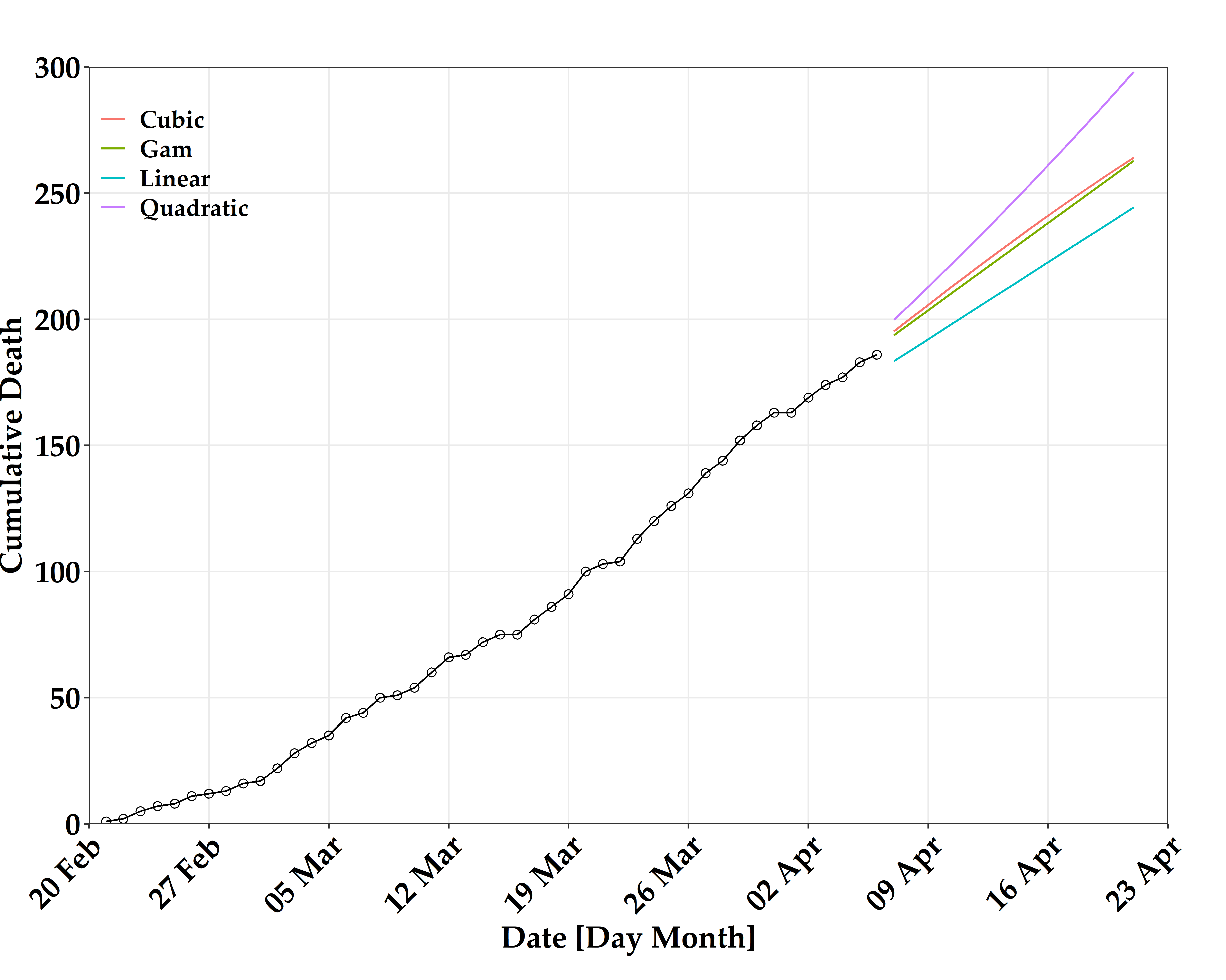
- 해당 기간 (2020-04-07 - 2020-04-21) 동안 대한민국에서 코로나 19 자료를 이용한 누적 사망자수 시뮬레이션 결과
- Gam 모형 결과 14일 이후 262명 사망자를 예측
| Date | Linear | Quadratic | Cubic | Gam |
| 2020-04-07 | 183 | 199 | 195 | 193 |
| 2020-04-08 | 187 | 206 | 200 | 198 |
| 2020-04-09 | 192 | 212 | 205 | 203 |
| 2020-04-10 | 196 | 219 | 210 | 208 |
| 2020-04-11 | 200 | 226 | 216 | 213 |
| 2020-04-12 | 205 | 232 | 221 | 218 |
| 2020-04-13 | 209 | 239 | 226 | 223 |
| 2020-04-14 | 213 | 246 | 231 | 228 |
| 2020-04-15 | 218 | 253 | 236 | 233 |
| 2020-04-16 | 222 | 261 | 241 | 238 |
| 2020-04-17 | 226 | 268 | 245 | 243 |
| 2020-04-18 | 231 | 275 | 250 | 248 |
| 2020-04-19 | 235 | 283 | 255 | 252 |
| 2020-04-20 | 240 | 290 | 259 | 257 |
| 2020-04-21 | 244 | 298 | 264 | 262 |
- 가시화를 위한 초기 설정
- 해당 기간 (2020-04-07 - 2020-04-21) 동안 대한민국에서 코로나 19 자료를 이용한 누적 사망자수 시뮬레이션 시계열
sMinDate = as.Date(min(dfDataL2$dtDate, na.rm = TRUE) - 1)
sMaxDate = as.Date(max(dfDataL2$dtDate, na.rm = TRUE) + 3)

ggplot(data = dfDataL2, aes(x = dtDate, y = nDeath)) +
   theme_bw() +
   geom_point(shape = 1, size = 2.2) +
   geom_line(data = dfModel, aes(x = dtDate, y = pred, col = model), size = 0.95) +
   scale_x_date(expand = c(0, 0), date_minor_breaks = "7 days", date_breaks = "7 days", date_labels = "%d %b", limits = c(sMinDate, sMaxDate)) +
   scale_y_continuous(expand = c(0, 0), minor_breaks = seq(0, 300, 50), breaks = seq(0, 300, 50), limits = c(0, 300)) +
   labs(
      x = "Date [Day Month]"
      , y = "Cumulative Death"
      , fill = ""
      , colour = ""
      , title  = ""
      , subtitle = ""
      , caption = ""
   ) +
   theme(
      plot.title = element_text(face = "bold", size = 18, color = "black")
      , axis.title.x = element_text(face = "bold", size = 18, colour = "black")
      , axis.title.y = element_text(face = "bold", size =18, colour = "black")
      , axis.text.x  = element_text(angle = 45, hjust = 1, face = "bold", size = 18, colour = "black")
      , axis.text.y  = element_text(face = "bold", size = 18, colour = "black")
      , legend.title = element_text(face = "bold", size = 14, colour = "white")
      , legend.position = "none"
      , legend.justification = c(0, 0.96)
      , legend.key = element_blank()
      , legend.text = element_text(size = 14, face = "bold", colour = "white")
      , legend.background = element_blank()
      , text = element_text(family = font)
      , plot.margin = unit(c(0, 12, 0, 0), "mm")
   ) +
   facet_wrap(~ model) +
   ggsave(filename = paste0("FIG2/Img02_Using_ggplot2.png"), width = 10, height = 8, dpi = 600)
[전체]
참고 문헌
[논문]
- 없음
[보고서]
- 없음
[URL]
- 없음
문의사항
[기상학/프로그래밍 언어]
- sangho.lee.1990@gmail.com
[해양학/천문학/빅데이터]
- saimang0804@gmail.com
본 블로그는 파트너스 활동을 통해 일정액의 수수료를 제공받을 수 있음
'프로그래밍 언어 > R' 카테고리의 다른 글
| [R] R을 이용한 통계 분석 및 데이터 시각화 : ggplot2 (facet_grid) (0) | 2020.04.07 |
|---|---|
| [R] R을 이용한 통계 분석 및 데이터 시각화 : ggplot2 (geom_histogram) (0) | 2020.04.07 |
| [R] R을 이용한 통계 분석 및 데이터 시각화 : ggplot2 (geom_tile) (0) | 2020.04.07 |
| [R] R을 이용한 통계 분석 및 데이터 시각화 : ggplot2 (geom_boxplot) (0) | 2020.04.06 |
| [R] R을 이용한 통계 분석 및 데이터 시각화 : ggplot2 (geom_point) (0) | 2020.04.06 |


최근댓글